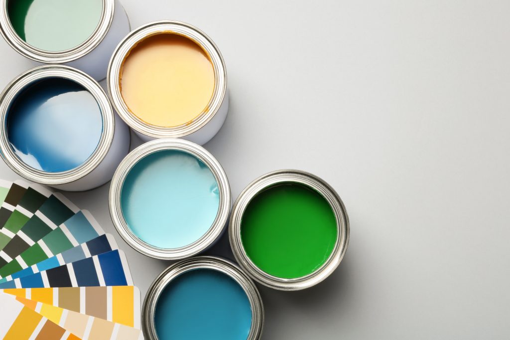
So, you have a website and you’re looking for a unique color palette that you can use to help your site stand out. The only problem is, you’re struggling to come up with a combo that doesn’t look like something another website is using already.
Well, there are all different types of color schemes that look good together. And believe it or not, if you get creative, you can even find a look that is somewhat unique to you and your brand!
In this article, we’ll break down a few different color palettes and color schemes, as well as tell you a few unique color combos that go well together. Now then, let’s get started!
1. Cool Mountain (Light Blue/Dark Gray/Brown)

If you’re looking for something that is a bit relaxing but also packs quite the punch then go with this cool, mountain-themed color scheme. Sure, the light blue and dark gray combo is a classic that is used a ton. But the addition of brown can help you make the look your own, which is the overall goal here.
2. Death Valley (Dark Red/Orange/Brown)
We know, there are loads of websites online with red or orange color schemes. But when you combine the two colors, you get an eye-catching color clash that is sure to grab the user’s attention… and it isn’t used a bunch, either!
And like the previous combo, the addition of brown helps you create a unique look that is identifiable to you and your brand.
3. Mother Nature (Light Blue/Dark Gray/Forrest Green)
This nature-themed color scheme is another light blue and dark gray combination… but with forest green instead of brown. If you decide to go this route, you’ll give your users flashbacks to the last beautiful mountain view that they saw, which is a wonderful mental image, to say the least.
4. Ocean Spray (Dark Blue/Light Blue/Sand)
If you’re looking for something with some beachy vibes, give this ocean spray color palette a try and see how you like it. The dark blue/light blue clash will make you and your users feel like you’re right on the water. And if you’re not a fan of the sand color, you can substitute it for a light gray to get a similar effect.
5. Berry Blues (Navy/Indigo/Light Gray)
If you’re a big fan of blues, but want to create something that is different from every other white and blue website online, berry blues is the palette for you. The navy and indigo combo gives you two rarely used shades of blue to work with. The addition of light gray balances things out beautifully, too.
A pro tip? If you’ve got an image that you like, use a color picker from image tool to grab some of the various shades from the image. That way you can use them for your site to create an awesome look that you and your users will love!
5 Types of Color Schemes
Well, there you have it! Those are 5 types of color schemes that you should consider trying!
As you can see, if you know what colors go well, you can find a combo that isn’t as popular as some of the more standard choices. That can help you create a brand online that stands out from the crowd.
A pro tip? Stick to three colors that go well together, and then use white space design, to make your site. You’ll be able to make something that looks good without giving you and your users a headache.
Looking for more graphic design tips and tricks? Check out our blog!